
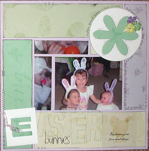
I don't think I really like this one. I'm not sure what is wrong with it! I just don't think I'm a pastel kinda girl. Well, I'm not thrilled with the Joanne's rub-ons, the ones used in the title - aster. They are sopose to be white, looks more like transparent!! Any suggestions?
1 comment:
maybe take a black pen and trace around the letters to make it stand out more. I think it's beautiful layout!
Michelle
Post a Comment